
Mercedes Benz Mobile App
Redesign
UX/UI Lead Design (2023-2024)
Our biggest challenge in this redesign was overcoming a lack of trust in the UX process, following several unsuccessful attempts to implement meaningful enhancements. We’d already identified many user pain points and complaints but faced hurdles in gaining approval for a user-centered redesign approach. Despite time constraints and a constant influx of feature requests, we initiated a more structured UX process—validating each feature with users and prioritizing improvements based on real needs. Through persistent advocacy and a step-by-step approach, we gradually earned the approval and support of our managers and stakeholders, ultimately paving the way for a fully aligned and enhanced app redesign.
UX Process for the Redesign
At the outset, our team was not provided with a dedicated Product Owner or Project Manager, so I took this as an opportunity to step up and lead the project. This initiative has since evolved into a structured, multi-phase redesign effort:

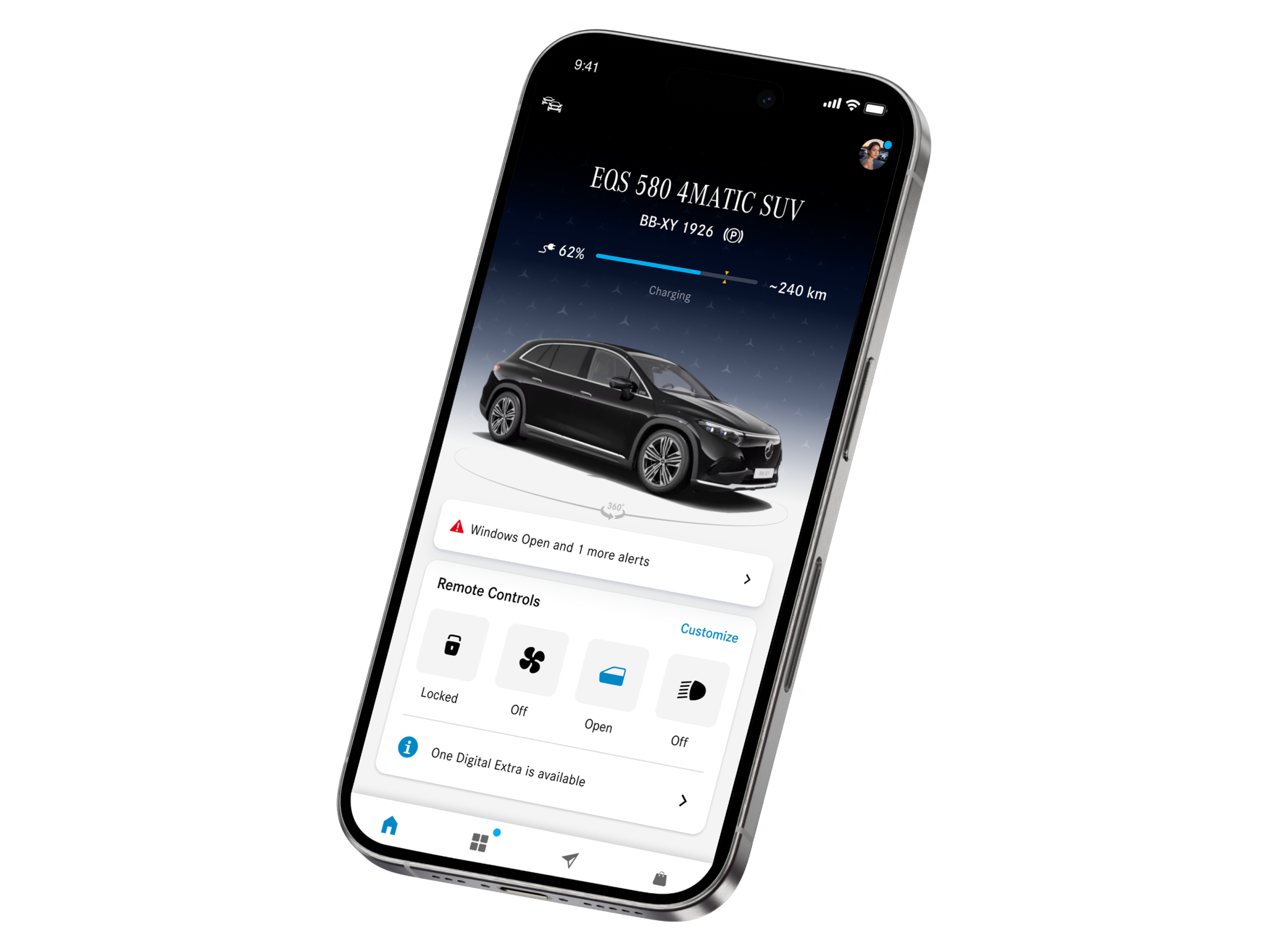
Homescreen redesign
The initial focus was on revamping the homescreen to establish a modern, intuitive interface and build trust with stakeholders. This foundation allowed us to gather valuable feedback and set the direction for a more significant redesign.

UX App Redesign
With the success of the homescreen redesign, we extended our efforts to the entire app, focusing on creating a cohesive, user-centered experience that aligns with both business goals and user needs. This phase is an ongoing transformation to make the app more accessible and efficient.

Map Redesign for Electric Vehicles
Currently, my primary focus is on enhancing the map tab, especially with electric vehicles as a strategic priority. I am redesigning elements to streamline public charging interactions, ensuring a smoother and more supportive experience for EV users as they navigate charging options.
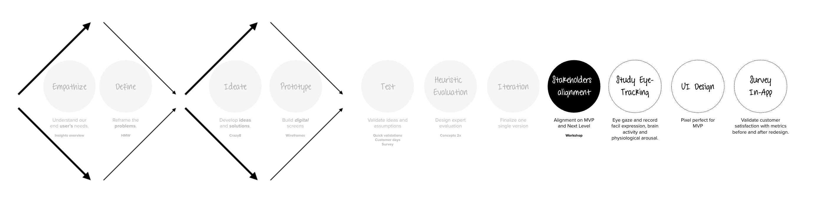
UX Process for the Redesign
Our process began with thorough research to understand user needs and frame key problems. We then moved into ideation and prototyping, developing digital screens and exploring solutions through iterative design. Following testing and heuristic evaluation by experts, we refined a single version in the iteration phase. Finally, we conducted workshops with stakeholders for alignment on the MVP and next steps, ensuring our solutions met both user and business goals.
Homescreen Kick-Off
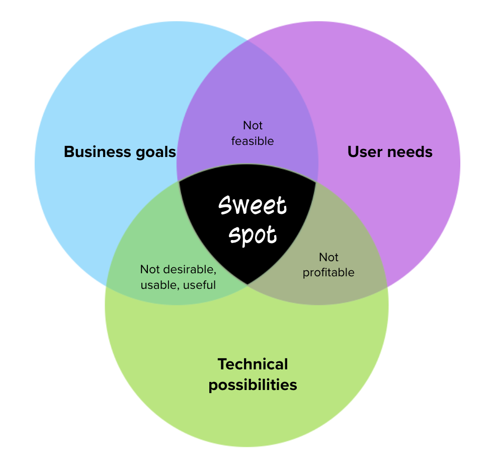
Given the complexity of our product, we began the redesign with the homescreen to engage stakeholders and build trust. Over the year-long project, we focused on hitting the “sweet spot” where business goals, user needs, and technical possibilities intersect. This Venn diagram guided our approach:
Business goals ensured profitability and strategic alignment.
User needs kept the product desirable and user-friendly.
Technical possibilities addressed what was feasible within current constraints.
By balancing these factors, we transformed the product into a solution that met stakeholder expectations and elevated the user experience, setting a strong foundation for future enhancements.
Discovery
UX/UI Trends Analysis
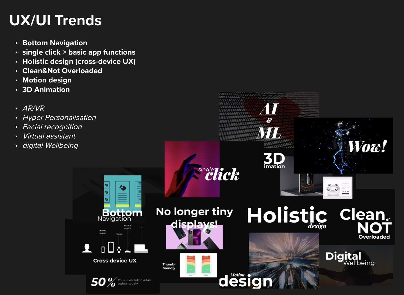
We examined the latest UX/UI trends, such as bottom navigation, single-click actions, and holistic cross-device design, to inform our approach and ensure the interface aligns with modern user expectations.
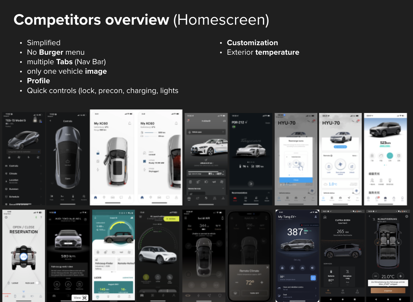
Competitor Analysis
Analyzed competitors' homescreens to identify common features, such as simplified navigation and quick controls, providing insights into effective elements and areas for differentiation.
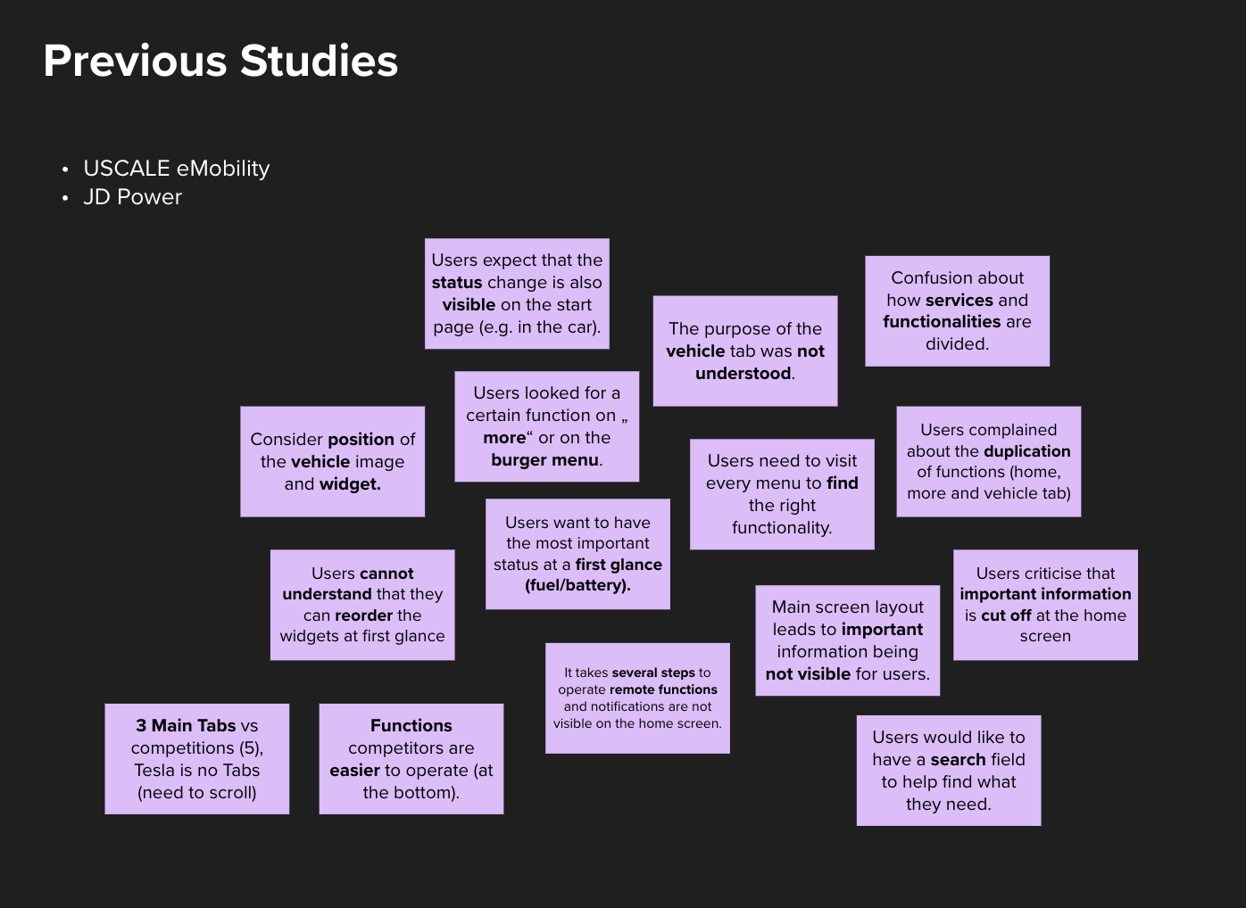
Competitor Analysis
Reviewed findings from previous user studies to understand user pain points, such as difficulties with navigation, hidden functions, and the need for important information at a glance.
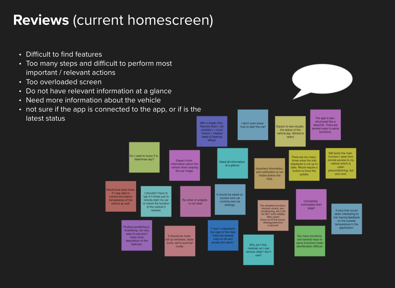
User Feedback Review
Gathered and analyzed user reviews of the current homescreen to identify specific frustrations, including feature accessibility issues and information overload.
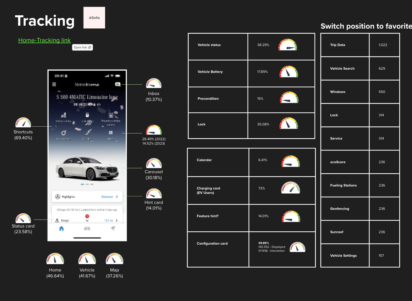
Tracking Analysis
Analyzed tracking data to observe user interaction patterns on the homescreen, helping us understand which features are most and least used.
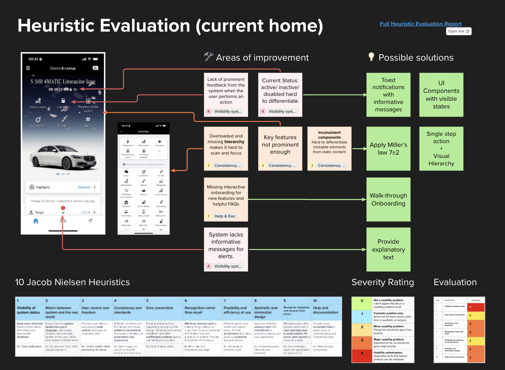
Heuristic Evaluation
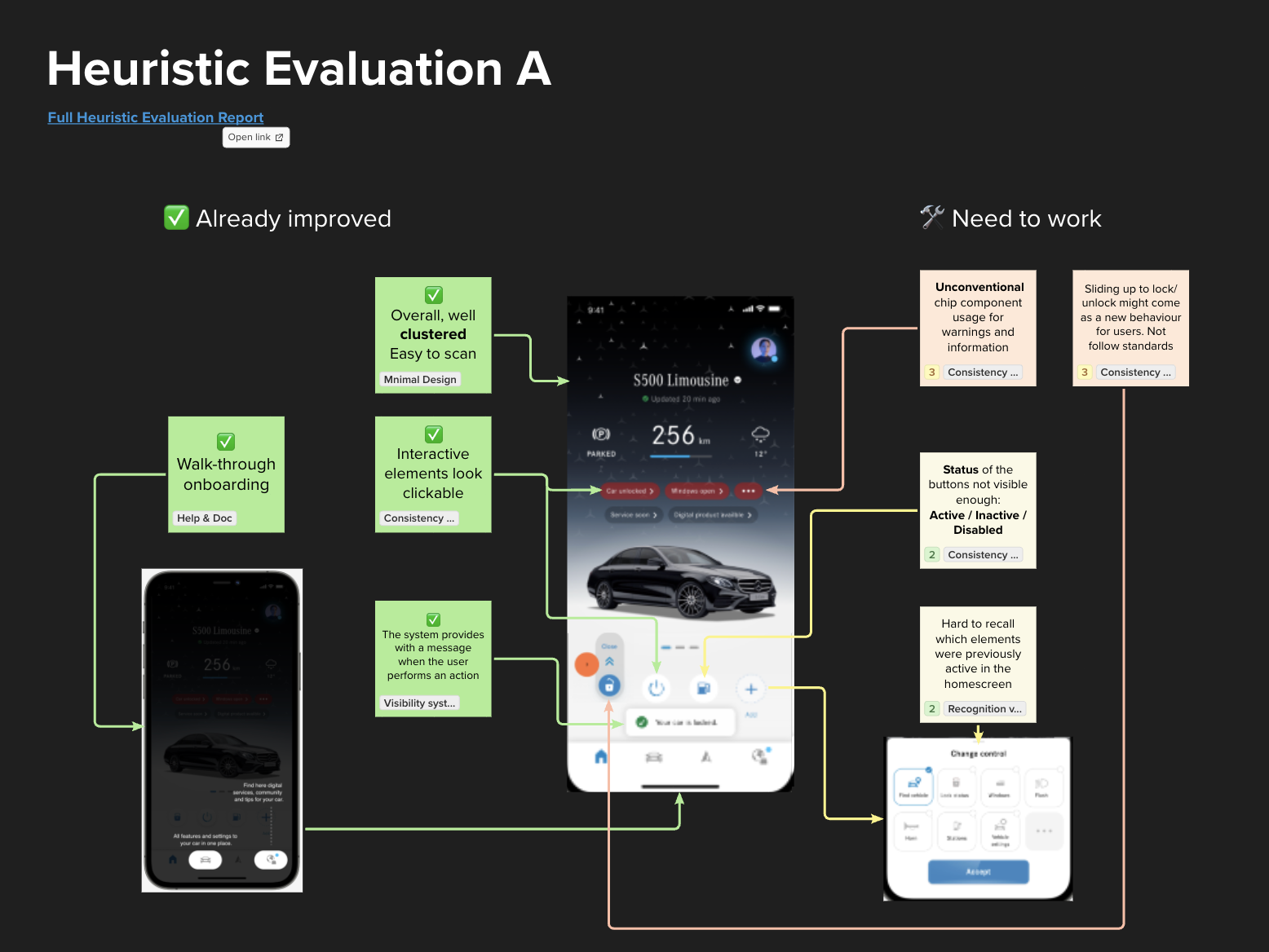
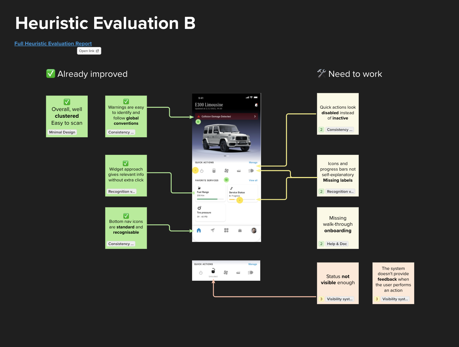
Conducted a heuristic evaluation to pinpoint usability issues, such as poor feedback, inconsistent components, and a lack of visible hierarchy, guiding our recommendations for improvement.
Ideation
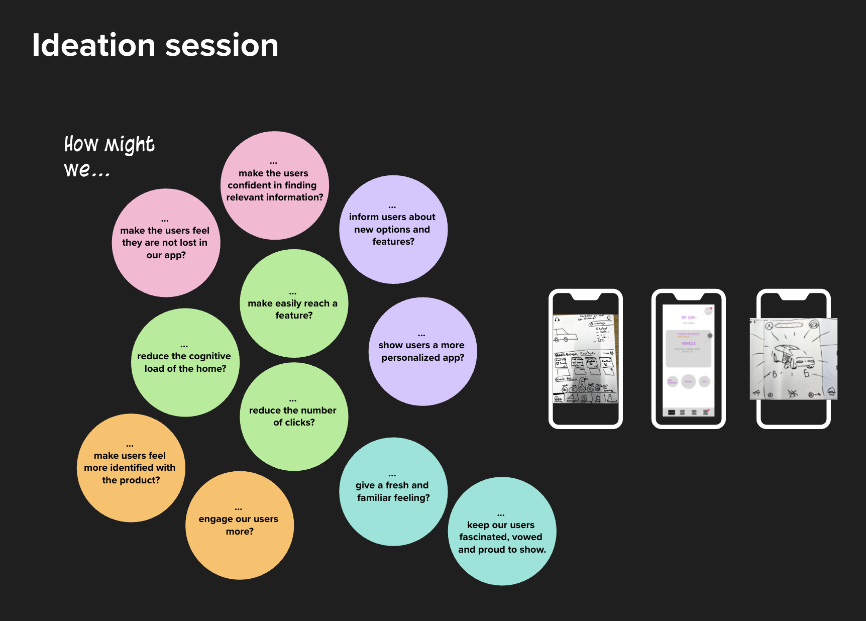
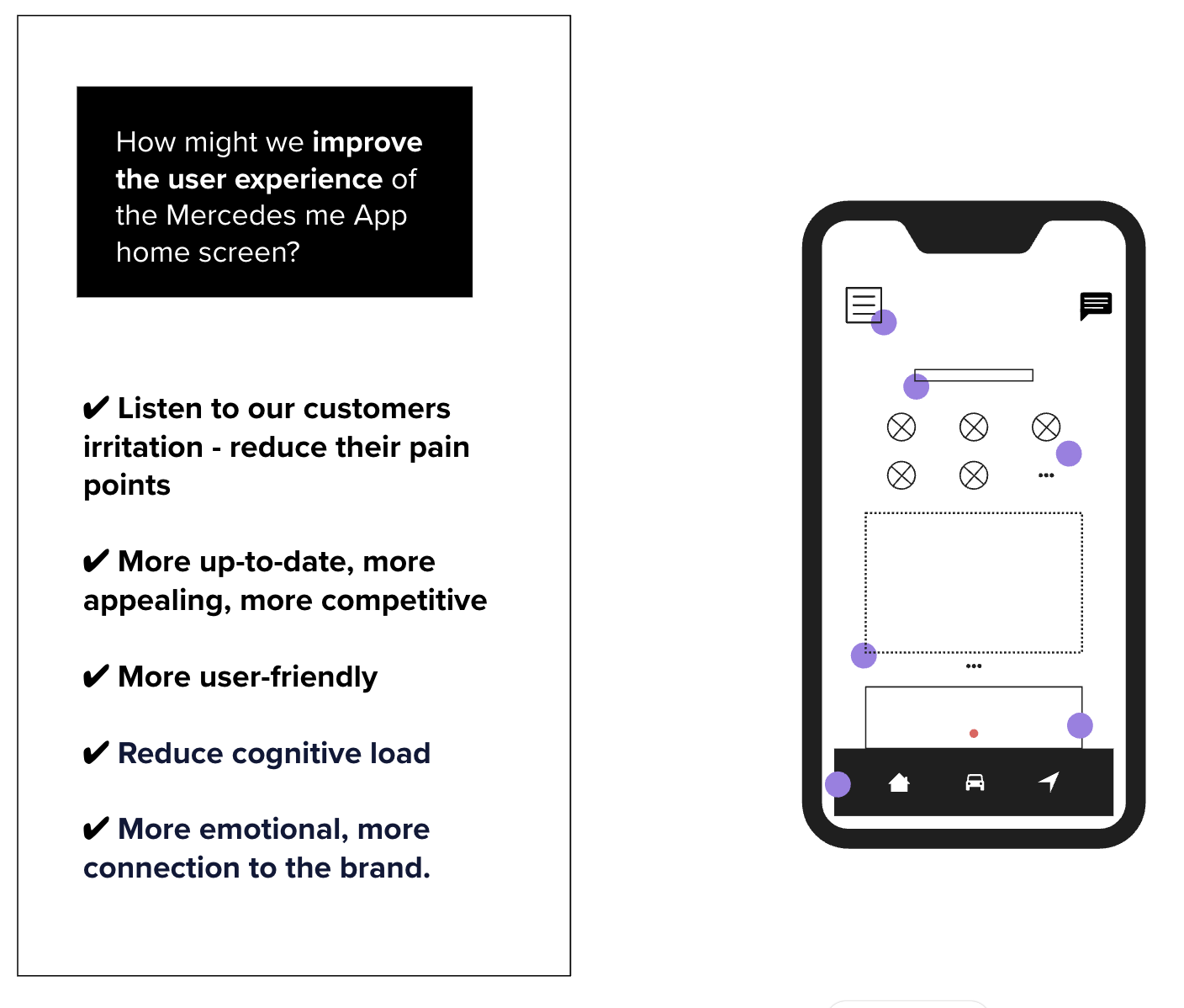
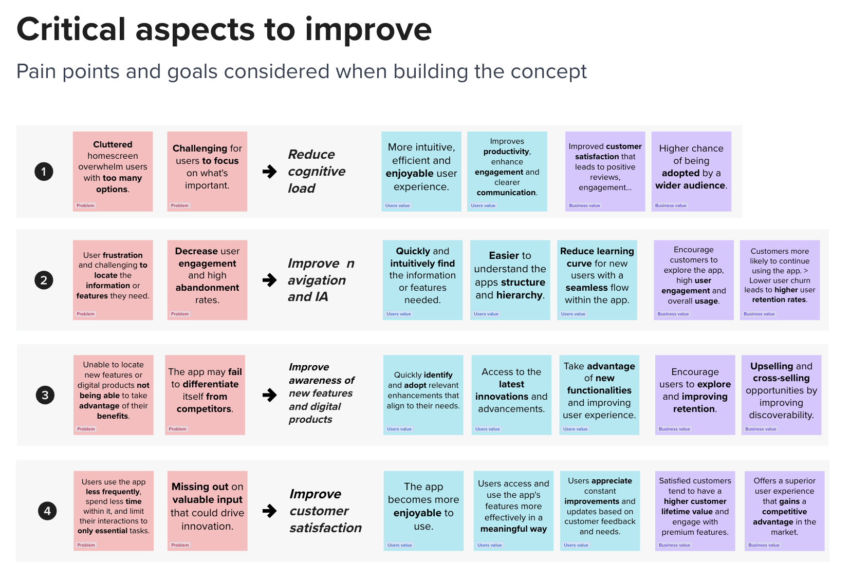
In the ideation phase, we asked "How might we..." questions to reimagine the homescreen experience. Key focus areas included making information easy to find, reducing cognitive load, and creating a personalized, engaging interface. Our goals were to address user pain points, improve usability, and strengthen the emotional connection to the brand. This led to concept sketches and initial wireframes, setting the foundation for a modern, user-friendly design.
Validation
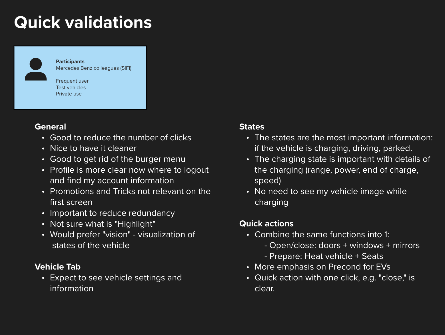
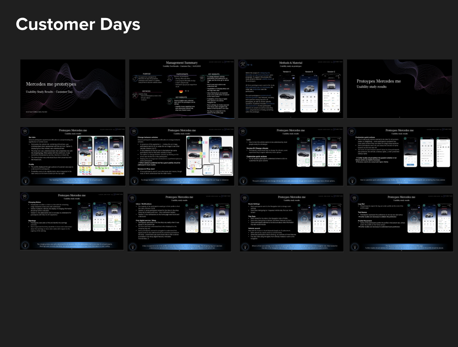
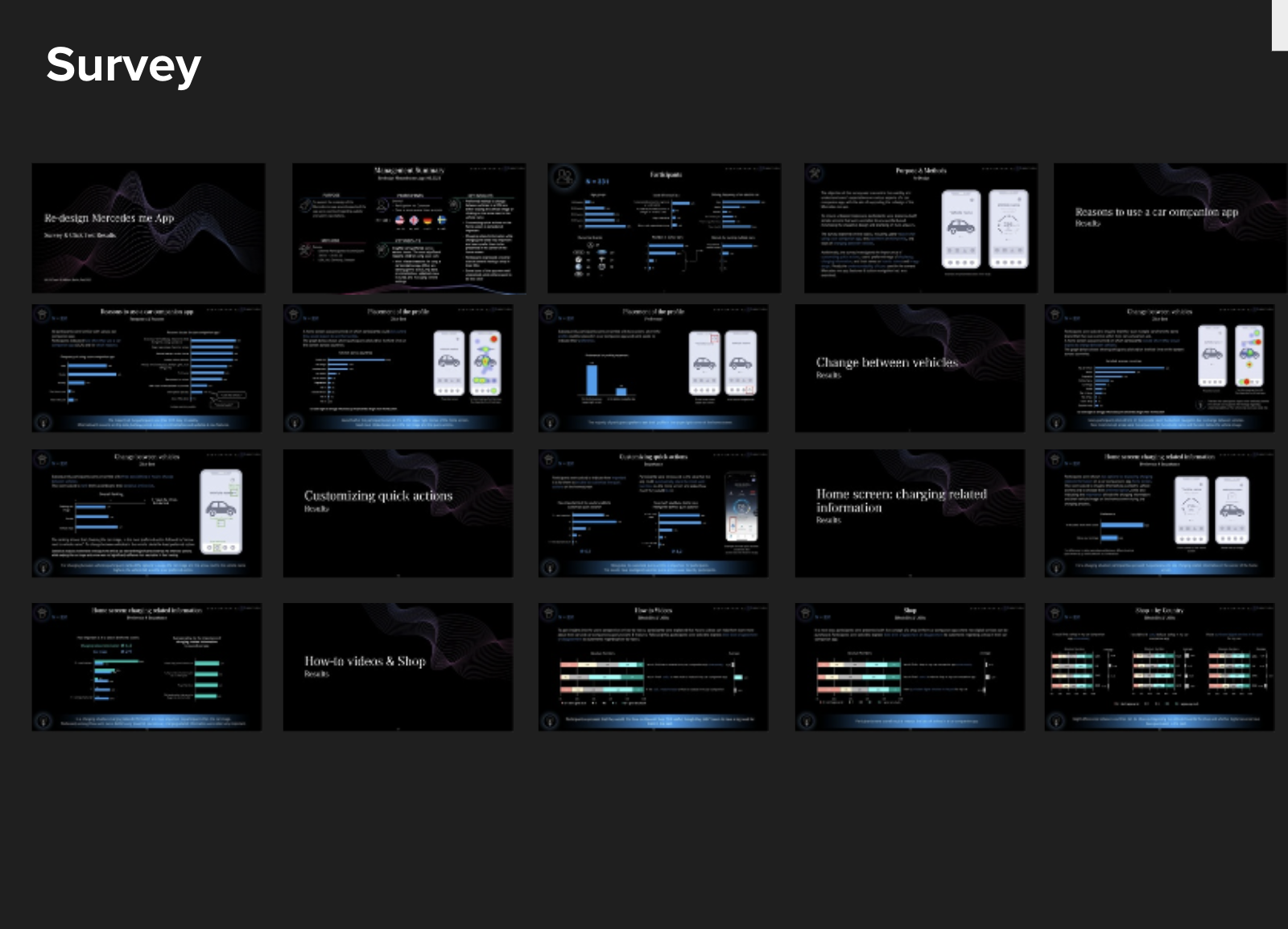
We conducted quick validations, customer days, surveys, and heuristic evaluations to test our design concepts. Feedback showed a preference for reduced clicks, simplified layouts, and clearer status displays. Key insights included the need for streamlined quick actions, enhanced state visibility, and user-friendly onboarding. Our heuristic evaluation revealed areas for improvement in system feedback, consistency, and labeling. Based on these findings, we merged the best elements from both designs to enhance usability and align with user expectations.
Heuristic Evaluation
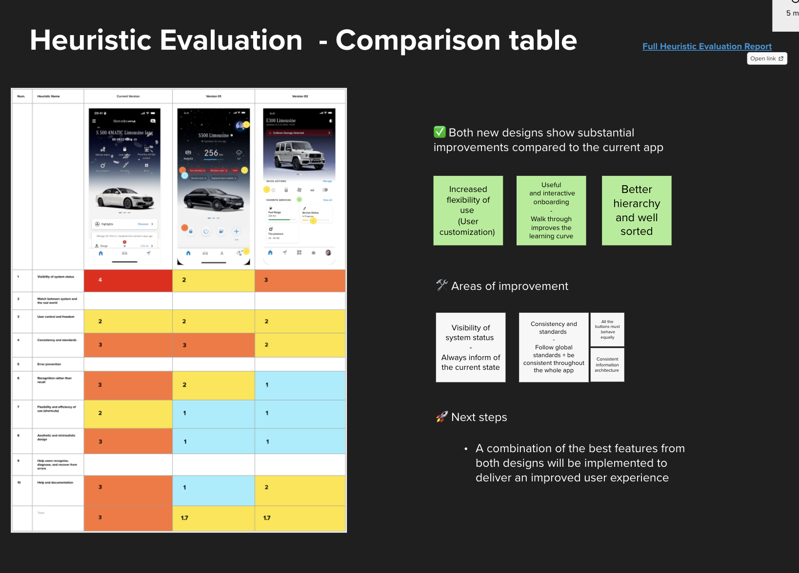
For this validation phase, we conducted heuristic evaluations on different versions of the design to identify strengths and areas for improvement. Version A highlighted effective clustering and clickable interactive elements but needed clarity on button states and warnings. Version B showed strong usability with recognizable navigation icons and widget displays but required clearer status indicators and improved feedback for user actions. Through a comparison table, we identified specific improvements for visibility, consistency, and user customization. Moving forward, we will integrate the best elements from both versions to optimize user experience comprehensively.
Iteration & Alignment
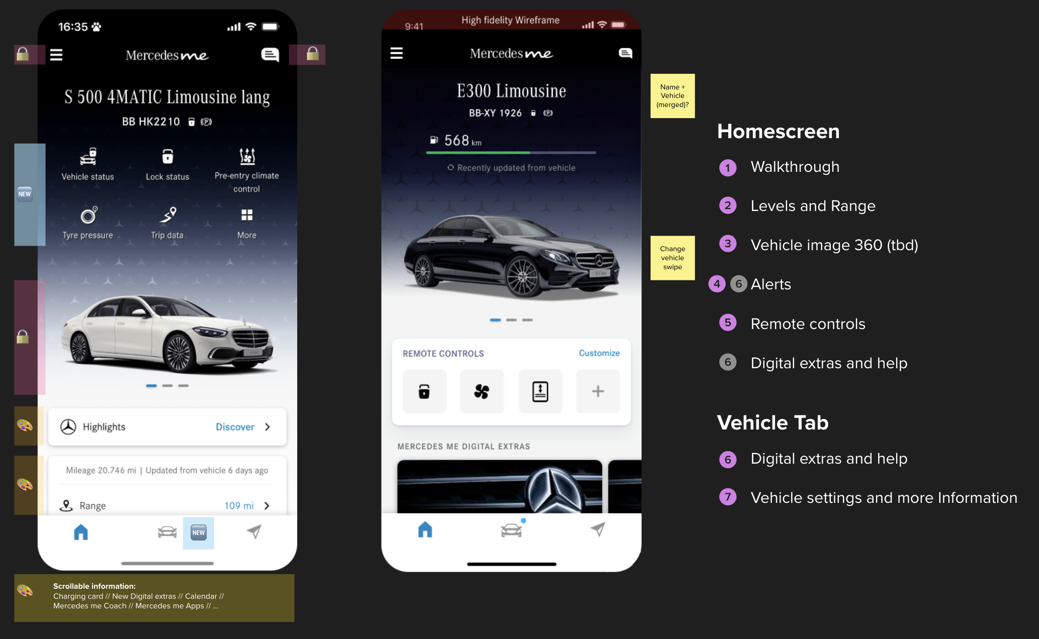
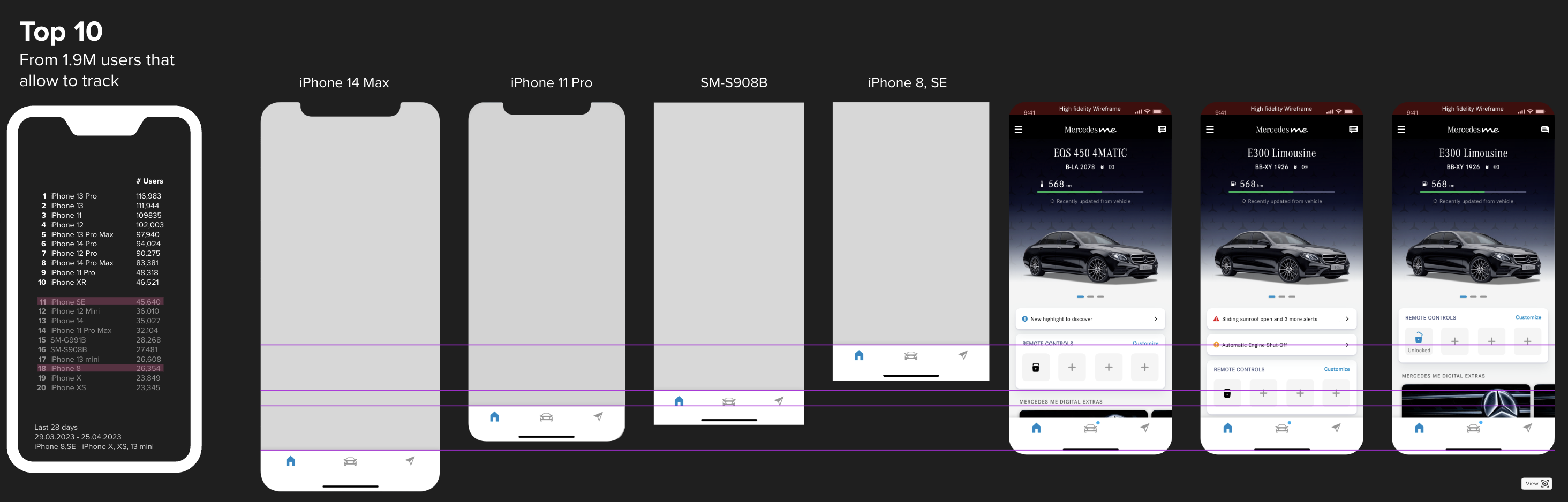
In the final phase of our project, we focused on iterating the designs and aligning with key stakeholders. We refined the interface based on feedback, ensuring optimal performance across top devices. Through iterative testing, we adjusted the layout, navigation, and customization options to enhance usability. The process included detailed reviews with stakeholders, allowing us to address strategic objectives and secure final alignment on the MVP and next steps. This collaboration strengthened our design’s value and prepared us for a successful handover to development.
🍾 Conclusion
In conclusion, the entire redesign process garnered high satisfaction from all stakeholders, who appreciated both the outcomes and our collaborative approach. Following the feasibility check, we successfully translated our findings into actionable user stories, setting a solid foundation for the comprehensive UI and UX overhaul of the mobile app, which is now underway. This milestone marked an essential starting point for redefining the app experience.

